Part of the creative process for me (and many other artists) involves recording ideas when they pop up, or risk forgetting them! Enter the indispensable art journal. I generally toggle between four of them, each for a different purpose: ideas for new materials and techniques, pattern designs and sketches, testing for current or upcoming paintings, and (the focus of this post) color recipe journals.
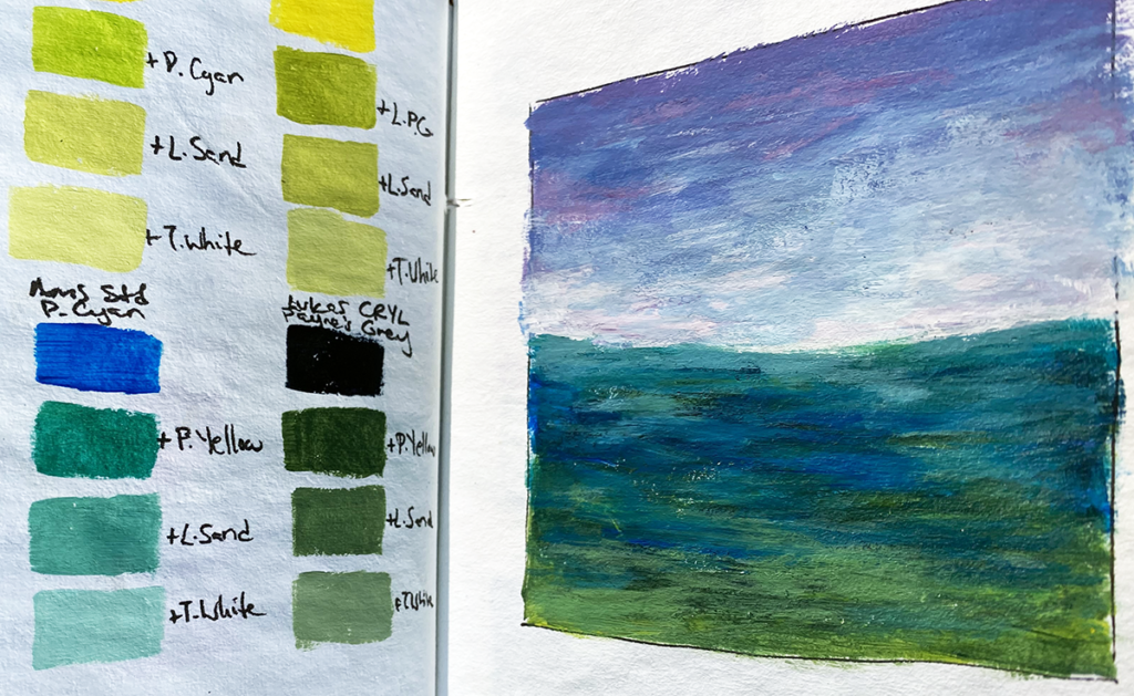
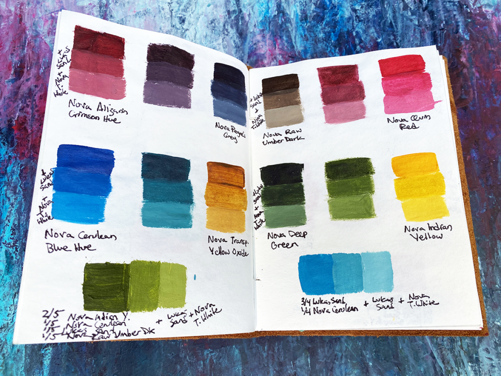
Whenever I go to an art supply store, there’s usually one exciting new color (or three!) that will catch my eye. If it comes to the studio with me, then the first thing I do is get out the color journal, a few other paints, and start some swatches. This allows for me to quickly check and record several things:
- Any issues right off the tube? Wrong consistency or dried up?
- Is it transparent, opaque, or somewhere in between? Is there a sheen to it? Does it match what’s stated by the manufacturer on the tube?
- Once the mixing begins, does it play well with other brands and/or viscosities? Any unexpected granulation?
- How does it compare to other same-name colors? Depending on the paint quality and pigment load, different brands will mix differently. This is especially true with pre-mixed colors like Payne’s Grey where one brand’s formula may be bluer than another. There are also times when even with professional paints, the colors may be inconsistent across product lines or batches.
- Does it have high staining power? Since I do a lot of glazing and layering of translucent layers, it’s important for me to know which ones are best used sparingly.
- How does it look when mixed with white gesso, an off-white, and/or Payne’s Grey? What does it look like when mixed with some of my (at the moment) favorite colors?
That seems like a lot, and it is, but just a few notes will do. Through the testing process and the resulting visual reference, a lot can be recalled about a specific tube of paint without having to test it again and again. Phew!
Besides the initial swatches, here are a few of the methods I use to create my own custom colors:
- After a painting session, I test interesting new colors using what’s left on the palette, then I try to figure out the “recipes” and swatch them.
- Sometimes I try to recreate hard-to-find colors in case they get discontinued. More often than not, I end up with unique colors that I like even more than the originals!
- If I’m creatively blocked, one of my prompts is to grab 3 random colors and see what interesting mixes I can get with them.
- When I’m planning a large painting or a series, I frequently create custom color schemes, mix them in large batches, then store them in airtight containers. And if I run out of one of the custom colors, all I have to do is reference the color journal and I can mix more!
If you’ve made it this far, I hope you enjoyed learning a bit about my creative process! 😊